
A modern, passenger-first redesign of the SAS mobile app focused on clarity, speed, and brand consistency. The goal was to simplify booking and trip management while giving the experience a clean, Scandinavian look that feels premium end-to-end.
Context
At the time, the app felt dated and fragmented, with heavy UI chrome and patterns reminiscent of early Android. Information hierarchy, navigation, and visual language didn’t reflect the efficiency and calm that travelers expect from a leading carrier. The redesign set out to realign the product with contemporary mobile standards and SAS’s brand values.
Details
Company:
Scandinavian Airlines
Time Frame:
Jan 19 – Apr 19
Role:
UI/UX Designer, Usability Researcher
Involvement:
App Interface, Interaction Design
Overview
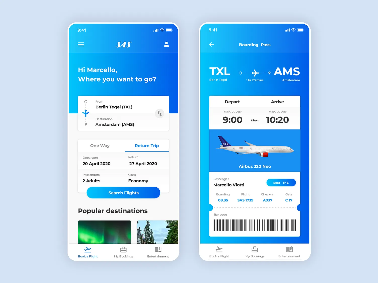
The work rethought core passenger journeys: searching and booking flights, check-in, seat selection, boarding passes, and trip management, across iOS and Android. The interface embraces generous spacing, high-contrast typography, and a restrained color system to keep the focus on decisions and key trip data. Components and motion rules form a cohesive system that scales from onboarding to day-of-travel.
Challenge
Airline flows are inherently dense: multiple legs, fare families, add-ons, traveler details, and payment—often on a small screen and under time pressure. The challenge was to cut cognitive load without hiding necessary options, reduce taps across the booking funnel, and present live trip data in a way that’s glanceable at the gate or in transit.
Process
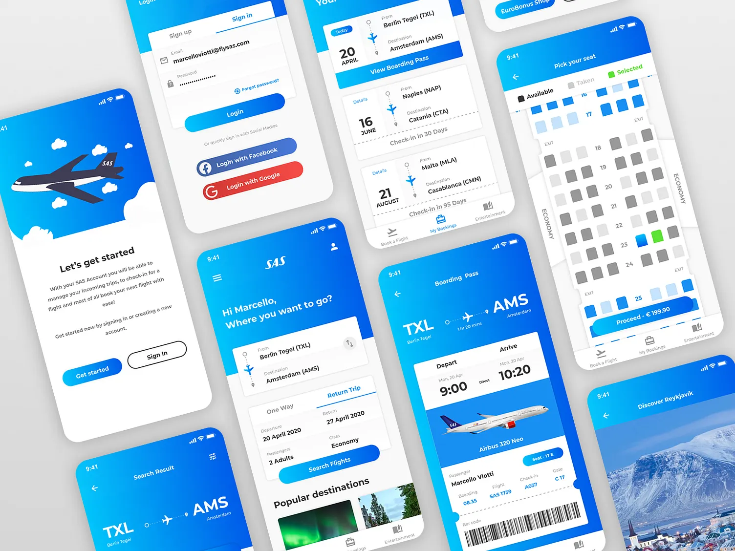
Work began with a heuristic audit and competitive review to document friction points and best practices. Low-fidelity wireframes explored navigation models and step reductions; successive prototypes validated changes to seat maps, fare selection, and the boarding pass. A shared component library and motion guidelines ensured parity between iOS and Android, while accessibility checks (contrast, tap targets, dynamic type) informed visual decisions. The result is a design system that supports rapid iteration and consistent delivery across the full travel journey.
Solution
The redesign introduces a streamlined booking funnel with clearer step progression, visible fare differences, and inline add-ons that don’t derail the flow. Check-in surfaces only what’s required at each step, seat maps emphasize availability and price at a glance, and boarding passes prioritize scannability with strong visual hierarchy. A calm blue gradient, clean type, and minimal iconography evoke a distinctly Scandinavian aesthetic while improving readability and accessibility.
Results
Prototype testing indicated fewer taps to complete a booking, faster recognition of fare options, and higher confidence during check-in and boarding. The refreshed visual language tightened brand expression and improved readability in bright and low-light environments. Overall, the redesign modernized the SAS mobile experience, aligning it with contemporary UX standards and the airline’s premium positioning.